
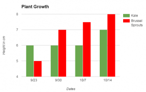
 Third graders at Trevvett Elementary have been studying plants (SOL3.5), measurement (SOL3.9a), and graphing (SOL3.17), so today students in Ms. Hufnell’s class learned how to graph their plant measurements using Google sheets. Over a 4-week period, they have measured and compared the growth of kale and brussels sprouts in the Trevvett Learning Garden. They had their data, and now they were going to analyze their data. I gave them each a blank Google sheets template in Google classroom. Before they recorded their data, we discussed how it should be organized. Should we put the plants in Column A and the dates in Row 1 or the reverse? (Most put plants in Column A). Would that affect the way the graph looked? (It didn’t, necessarily, because of the customization features under Chart Types). I explained that they would need to put their units of measurement as a label on the graph instead of in the data cells, otherwise the graph wouldn’t recognize the numbers (for example, put 5 instead of 5cm). After entering our data, we highlighted it and clicked the graph button. I showed them how to use the Customization tools to change the title and labels on each axis. Then we inserted the chart into our spreadsheet and moved it so it wasn’t covering up our data. Finally, the students clicked the bars to change their colors (use the paint bucket button). The graph made it easy to analyze and compare the plants’ growth. Which plant grew fastest? Which plant grew tallest? Why did the kale not grow at all for 3 weeks? What might be the reasons for the differences since they were both in the same garden with the same sunlight and rainfall? We published our spreadsheets and pasted the links to Google classroom. You can see an example here.

