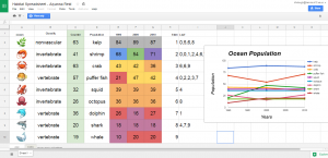
 Fifth graders at Holladay Elementary have been learning about stem-leaf plots and line graphs in Math (SOL5.15), and they have been studying ways to classify animals and plants in Science (SOL5.5). Today students in Ms. DiMatteo’s class created stem-leaf plots and line graphs about the populations of animals and plants in different habitats. First I gave each student a copy of this Google spreadsheet (you can make a copy by clicking File > Make a copy). They clicked the arrow in box A1 and chose a habitat from the drop down list. Depending on the habitat they choose, a list of animals and plants appears. Google now has emojis (click Insert > Special Characters > Emoji), so that’s where I got the images. Next the students had to identify each one as an invertebrate, vertebrate, vascular or non-vascular plant. I tried to include at least one of each kind. (You will notice as you edit the spreadsheet the counter numbers change, that’s supposed to happen). Next the students acted like scientists and recorded the data for each year by typing the number in the counter box at that moment. The numbers have conditional formatting rules that will turn them different colors based on their tens digits (to help with the stem-leaf plot). To create the stem-leaf plot, the students type the numbers 1-9 in the Stem column (column H), and record the ones digits in the Leaf column (column I). To create the line graph, the students highlight the data in rows G-E and click the graph/chart button. Then they click the “Chart Types” tab in the window that appears and choose a line graph. They also need to check the box that says, “Switch rows/columns” so each line shows a specific living thing. Finally, I showed them how to customize the colors, titles, and labels of their graphs by clicking on each one. As we looked at our data and discussed why there were more of the smaller creatures and less of the larger ones, and what would cause populations to increase or decrease. You can take a look at the students’ projects here.


