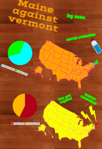
 Fifth graders at Davis Elementary have been learning about the northeastern region of the United States (NE1.1, NE2.2b). Their benchmark tests also revealed that they need extra practice with collecting, organizing, and interpreting data (Math SOL5.15). So today students in Ms. Elsea’s class gathered data about the northeastern states and presented their information with infographics. First, I instructed the students to choose two northeastern states to compare. We used Measure of America to get data about the population, education, economics, health, or whatever topic the students wanted to compare for their two states. Next we went to Piktochart to make our infographics. I showed them how to change the background and choose a font and color scheme. I encouraged them to use just a few colors and to be consistent with the colors across all the graphics and text. One of the first graphics we added was a map showing our two states. Then we added a pie chart comparing the data we had gathered, and I showed them how to add clip art that related to their data. Some students were able to add several graphics. Finally, we copied the links to our infographics, and posted them to our Google classroom page so we could see each others’ presentations. Take a look at some of them here.


